“I need some space to think” – it’s a feeling many of us have experienced as we are trying to come up with the next big idea or solve a problem. We’re feeling trapped by our own thoughts and need that spark of inspiration for the light bulb to turn on above our heads.
To a degree, collaboration can alleviate that sensation of being stuck. The art of collective problem solving helps us as individuals, and as a larger group, unlock the ideas in our head and elevate our thinking – molding and evolving a solution with each new piece of information. It guides us to be flexible and create iterations of our thoughts.
The environment is just as important as collaboration to achieving breakthroughs. As humans, our behavior is shaped by our environment. Our surroundings influence how we feel, how we think, and how we engage with other people. That feeling of “being stuck” while evolving an idea is partially caused by associating our mental block with our environment.

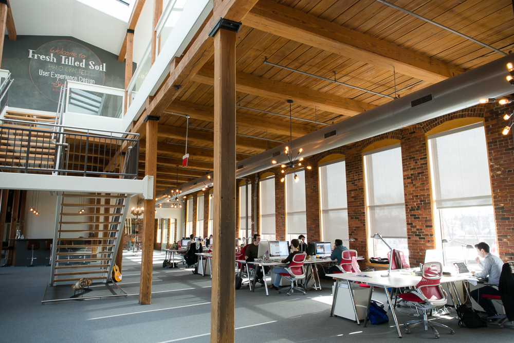
It took checking out dozens of buildings and speaking to countless designers and studio owners to find the look for a space that felt right for our brand. We made intentional design decisions when outfitting our space in Watertown to curate the experience for visitors and members of the Fresh Tilled Soil team. Each area of the office is carefully designed – from furniture to light fixtures – to match the purpose of the space and to invoke certain emotions and mindsets depending on where you are.
In our work, we are focused on every tiny detail of the user experiences that we create. Details are where the magic happens. Our design process is meticulous. It maximizes the actual design value of the work and the functionality for our clients’ users. We learn through user testing how people expect their user experience to be at each step of the way. We think about each individual UX element and how those building blocks come together as a final product. Every piece of the user experience plays a critical role in a user’s overall feeling. We pride ourselves on developing these unique user experiences for our clients.
We took the same approach we use for client projects and applied that design thinking and attention to detail to curate our office space – it is a physical representation of our understanding of how people experience a website, an application, or a space. We’ve created individual user experiences around the office by maximizing design and functionality while keeping in mind how those ladder up to an overall impression of Fresh Tilled Soil.
We took the same approach we use for client projects and applied that design thinking and attention to detail to curate our office space
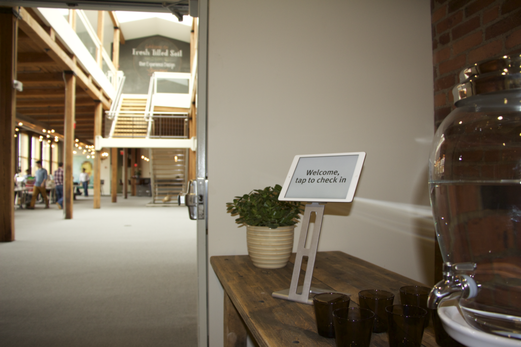
We began designing the entry experience by developing an application that welcomes guests into our office, allowing them to scroll through an employee directory on an iPad and select whom they are here to see. The selected team member then receives a text notifying him that his guest is here. Our visitors are encouraged to grab a snack or beverage and take a seat in one of our waiting areas that are designed to feel like you’re sitting in someone’s living room. This allows our guests to be more comfortable and at ease. In our main working area, the light fixtures were chosen for design and functionality to complement the industrial feel of our high ceilings, exposed beams, and brick walls, giving a calming ambiance to the space. It opens the minds of our designers and developers and lets their creative juices flow.

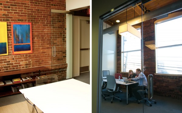
Continuing into our conference rooms, we made deliberate choices on aspects like lighting, seat comfort, and overall aesthetic to develop the mood for each space. Rooms with more rigid chairs and bright lighting are intended for working sessions and brainstorms, while others are fitted with relaxed lighting and comfortable chairs for sales meetings and one-on-one conversations. Adding IdeaPaint to our space was an innovative and fitting choice in our office because it fosters creativity, encourages collaboration, and changes the way people work. All of our conference rooms have at least one IdeaPaint wall, but are used in different capacities – anything from internal meetings to embarking on Deep Dives and Experience Mapping sessions with our clients, during which collaboration, sharing, drawing, moving around, and challenging ideas are integral to the process.

