For many of us, navigating through a digital product is relatively straightforward once we’ve used it a few times. You have your utility navigation, a primary nav menu, sub-navigation if applicable, and the act of moving around the product by using its features.
In some cases, we may have to consider a level up – above the entire experience we’re used to interacting with at the product level. Common cases of this are if you have multiple profiles in the same product, are invited to multiple teams or accounts, or are using a product that fits into a larger ecosystem or bundle of other separate products.
Generally we tend to call these concepts and related patterns “Account Switchers” or “Profile Switchers” and they take a variety of shapes and approaches. There isn’t a great deal of content on the subject at present, so we offer our attempt at classifying and illustrating some common cases and approaches below.
Profiles
Probably the most common example of this type of pattern is when users change the active profile used to contextualize their experience with the product. Some common examples that come to mind are:
- Netflix Profiles
Am I signed in as myself, a spouse, roommate, or child? - Google Analytics
I have multiple online properties I want to review. How to I switch to the site I want to analyze? - Uber Rider Profiles
I have a personal account but am also a Business Account owner or have been invited by an employer to put certain rides on the company. - Facebook Profiles
I have my personal profile but also run a Facebook Page for a company, organization, or group.
These patterns vary in how they’re executed in the interface, but the common elements tend to hinge around displaying which profile is active and how you would go about changing to another.

In some cases, the initial login will ask you to choose a profile, but more commonly you get signed in to the last active profile and can use a menu to select another.
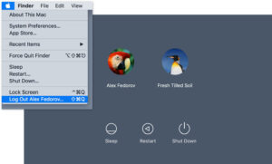
This concept also applies when considering an operating system where more than one user may be accessing a device.
Teams
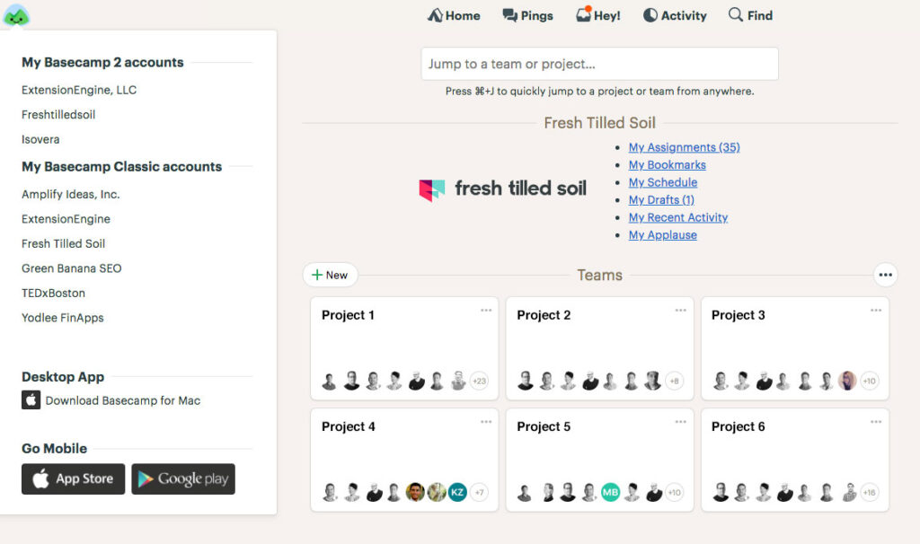
Similar to profile switching, team or account switching represents cases where you may be using the same product and the distinction needs to feel more separate. The two immediate examples are Basecamp’s Launchpad and Slack’s Team Switcher.
For these cases, a user is associated with more than one instance of a product and rather than having to sign into each instance separately, these teams have made it easy to jump from one instance to another using a menu.
Treating these cases as Profiles is either not technically feasible or desired, or is intentionally helping the user to focus on a wider set of features and interactions that feel even more contextually different than a profile.
In the case of Basecamp, version 2 of the product utilized a thin strip above the header if the user has been invited to additional teams and each product version allows a simple dropdown to move to that instance of the software. The current product uses the logo in the top left to display a menu allowing users to change between accounts.

Slack has a similar concept but approaches the interface control as a vertical menu to the left of the main product section.
Once you’ve been invited to a team you can associate it with the app and switch between instances with a single click. They also display the keyboard shortcut for team switching when you hover over the menu making it a faster and more ingrained action.
Products within Ecosystems
The third approach to navigating between an account or feature set has to do with separate products that are either being bundled or are the result of an acquisition. This practice isn’t always something that’s planned or fully intentional and in many cases can be a simple stopgap solution while a product is being redesigned and architected to blend the feature sets of two or more distinct products.
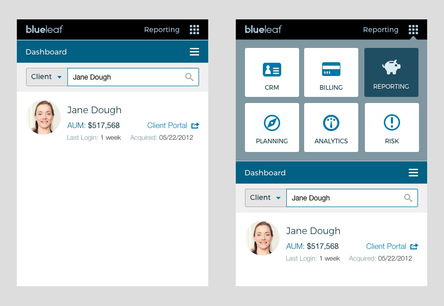
Blueleaf CEO John Prendergast explains that complex cases arise in Wealth Management products within FinTech. “A user may be working in a reporting application for a particular client and realize they need to access a billing application from a different company for the same client. Through a combination of single sign-on and a specific functional menu with deep linking, other company’s functionality is only a click away.”
“Whole product thinking encourages us to look beyond our application to the broader problems our customers face and the combination of solutions they use to solve them. We believe that interface design can bring these ecosystems to life by allowing navigation across previously siloed product experiences.”

Other cases that come to mind are when a company acquires another and wants to offer their users some or all of these new features quickly without fully baking them into the core product. Examples we’ve seen include anything from a top navigation with distinct hyperlinks to move between separate products licensed to the same user, or even the addition of a new navigation item that is clearly loading or navigating to a separate subset of features.
Best practice in terms of a user-centered approach to this would be to reimagine the existing product with the features and benefits of the newly acquired one as a new offering that feels cohesive, intentional, and consistent. Of course the reality of time, resources and prioritization play a major role here, so teams have to plan accordingly.
Conclusion
Offering your users the ability to easily identify how they’re interacting with your product makes absolute sense when you’re offering feature sets or distinct roles that are contextually separate. If supporting users invited to multiple instances of the product is required, a Team Switcher is likely the best approach. And if you’re part of an intentional ecosystem or bundle of products or have acquired a product, be thinking about a consistent pattern that makes it easy to see at a glance which product you’re actively using and how to navigate from there.
