We’ve written a lot about Design Sprints in the past. Heck, we’ve run hundreds ourselves, and taught workshops to thousands over the years. When our friends over at XPLANE asked for our help creating a visualization for a Design Sprint, we jumped at the chance.
Outcomes over process
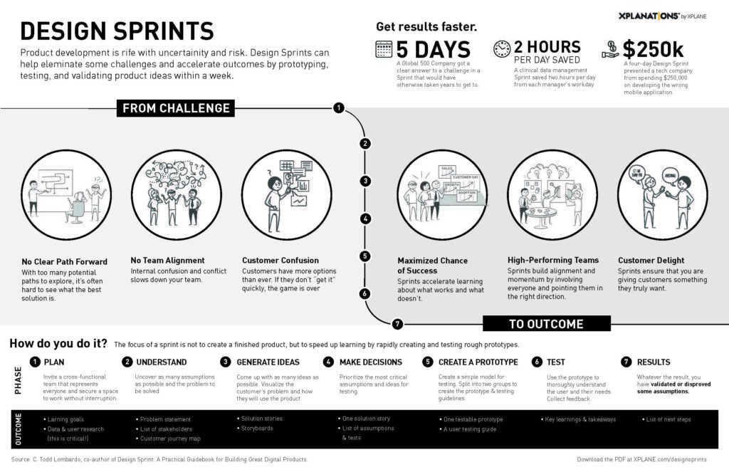
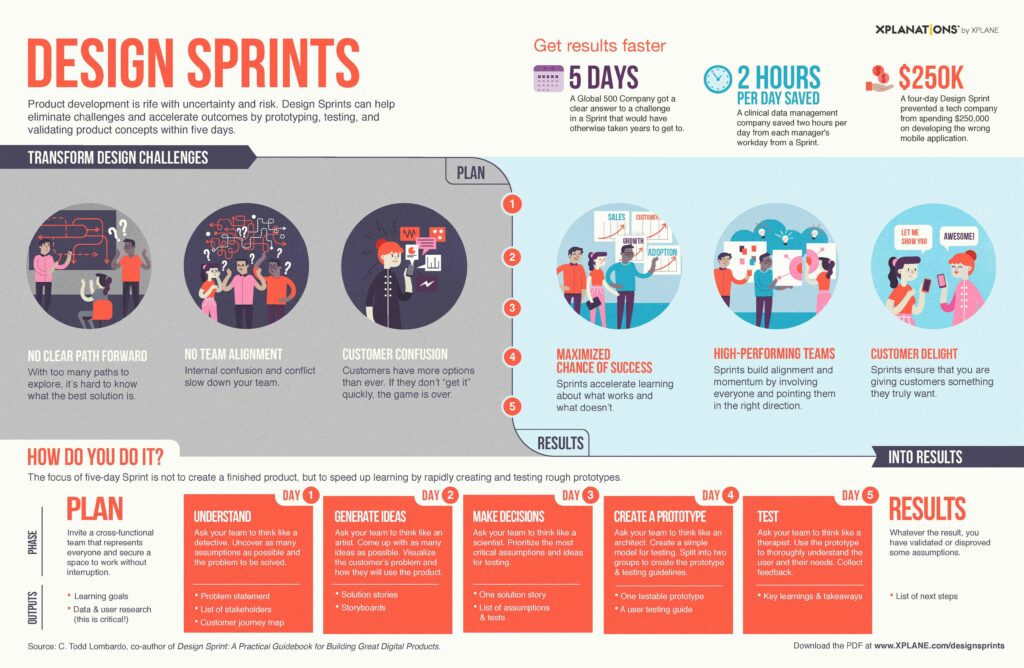
As with any good design, it begins with the audience or end user: What do they care about? What are their needs? This visualization is targeted to VPs, executives, and product leaders so a clear value proposition had to be the primary message. On top of that, many people learn by example, so we looked at our history of sprints and selected three examples to showcase the value of a sprint:
- A Global 500 Company got a clear answer to a difficult problem in a five-day Design Sprint that would’ve otherwise taken them over a year.
- A clinical data management company shaved two hours per day off of each manager’s workday with a Design Sprint.
- A four-day Design Sprint prevented a tech company from spending $250,000 on developing the wrong mobile application.
These three examples all had different outcomes, yet the process that got them there was similar. Not every project proceeded beyond the prototype phase, since one project was halted because of the test results. A Design Sprint won’t always take your ideas and prove them right. Sometimes you’re proven wrong. We argue that’s a very good thing ($250,000 worth of good!).
Just because a team spends five days on something doesn’t mean it’s valuable time spent. A Design Sprint has to drive toward a positive outcome. When we looked across all of our Design Sprints, three outcomes stood out above the rest:
- Maximizing success
- Aligning teams
- Delighting customers
This reflected well on the challenges we see from teams all the time: Lack of clarity, differing opinions on where to go next, and customers who aren’t clear about a new product or service features. This current-state vs. future state direction was chosen to reframe the piece and off we went.
Prototype and test
Did we prototype and test it? You bet! We drink our own Kool-Aid here are Fresh Tilled Soil. We shared each iteration with people who know us and what Design Sprints are about. Importantly, we also shared drafts with people who were unfamiliar with Design Sprints. If THEY could understand the process, how a Design Sprint works, and the value that can come from participating in one, then we knew we’d be on the right track! All of this feedback helped shape the infographic along the way.
From idea to infographic
Following is the progression the infographic took from start to finish:
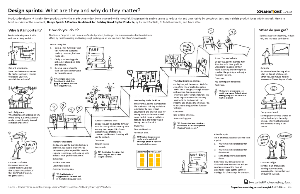
After an initial interview call with Dave Gray, Founder of XPLANE, he and his team produced a sketch-level iteration, called a “napkin.”

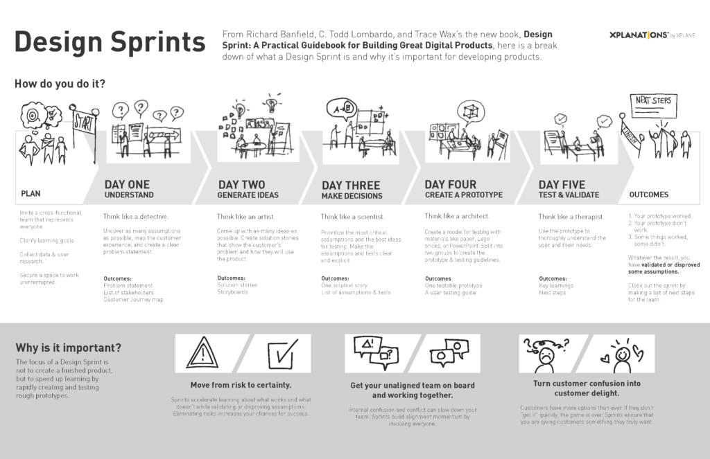
The feedback here was “too much text!” so we worked to refine our language and consider restructuring the overall graphic. We then started to get away from a “napkin” level prototype to a “blueprint” which had more polish. This blueprint would be the equivalent of a “wireframe” in today’s website and digital product worlds.

This iteration in particular placed too much emphasis on the process of the Design Sprint and not the outcomes, so we decided to switch up the hierarchy and focus on the challenges and outcomes and make the process secondary. This was the final “blueprint” version.

With the structure and content near final, the XPLANE team went and did what they do best – illustrate further, add color, and polish the piece.

Share this post with friends and colleagues if they are unsure if they want to use the Design Sprint framework.
Contact Us if you have any questions or would like to discuss whether your challenge would benefit from a Design Sprint.
