Skip to Main Content

JSTOR

Making millions of educational resources more accessible with a fresh approach to a massive digital library.

Challenge

The disorganized and disconnected nature of the JSTOR platform was hurting the user experience for millions of scholars, researchers, and students accessing its immense digital library. 

Solution

We took a blank slate approach to reimagine the entire user experience of the JSTOR digital library, from resource accessibility, to the look and feel, to light and fast site loading across all devices.

Impact

Our improvements to the user experience of the JSTOR digital library illustrated that you can design engaging, effective, and interesting search engine functionality for curated collections and content. 

The Challenge

JSTOR, a digital library for scholars, researchers, and students, needed a common digital language to streamline its platform and user experience. 

JSTOR uniquely offers up millions of academic journal articles, books, and primary sources contributed by nearly 1,000 publishers across more than 75 disciplines. JSTOR has also expanded into multiple product lines, necessitating a more consistent digital language. 

The platform is a Frankenstein mess of programs that have been bolted together and don’t make a lot of sense.

Additionally, the JSTOR team is large, cross-functional, and distributed across multiple locations. The need to unify the team around a common visual language was a top priority for this project. 

The team was eager to hear fresh ideas on how to increase user satisfaction, ease of use, and new user subscriptions.

The Solution

ADK reimagined JSTOR’s digital library to provide an engaging, effective, and interesting search experience that would allow users to easily find what they were looking for from over 12 million academic sources.

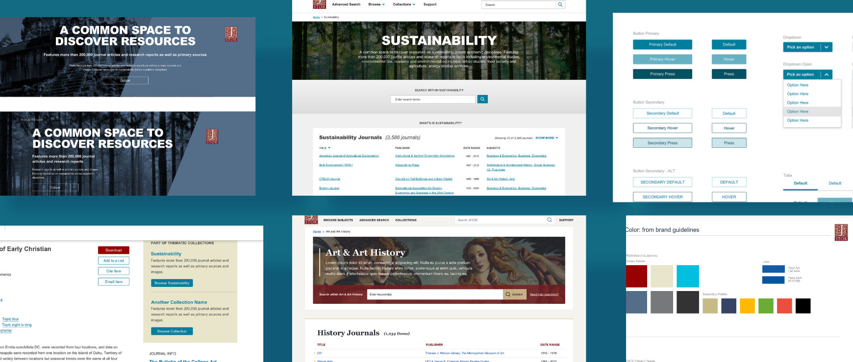
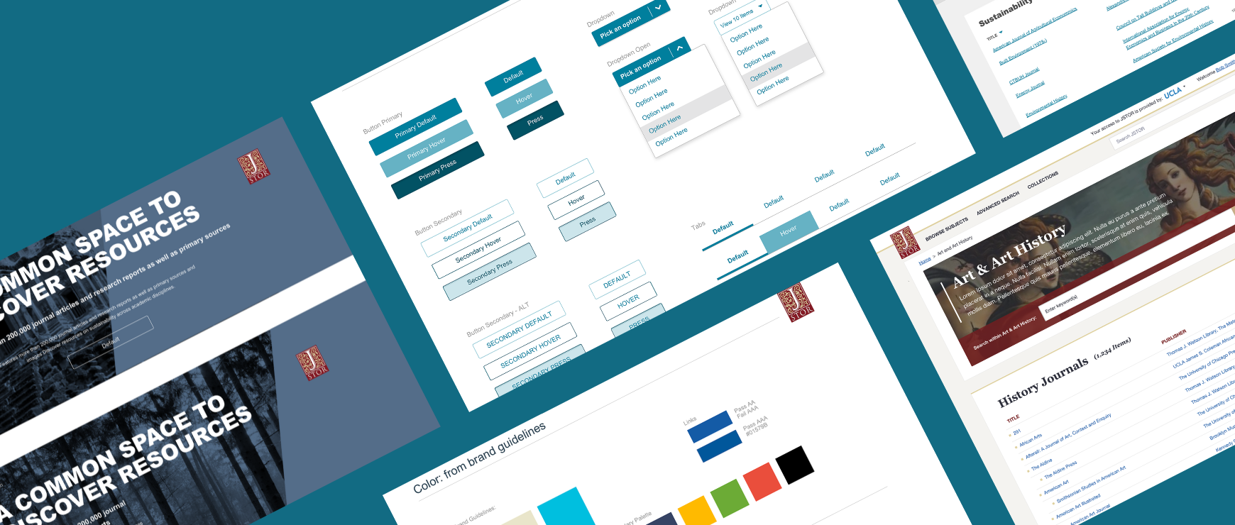
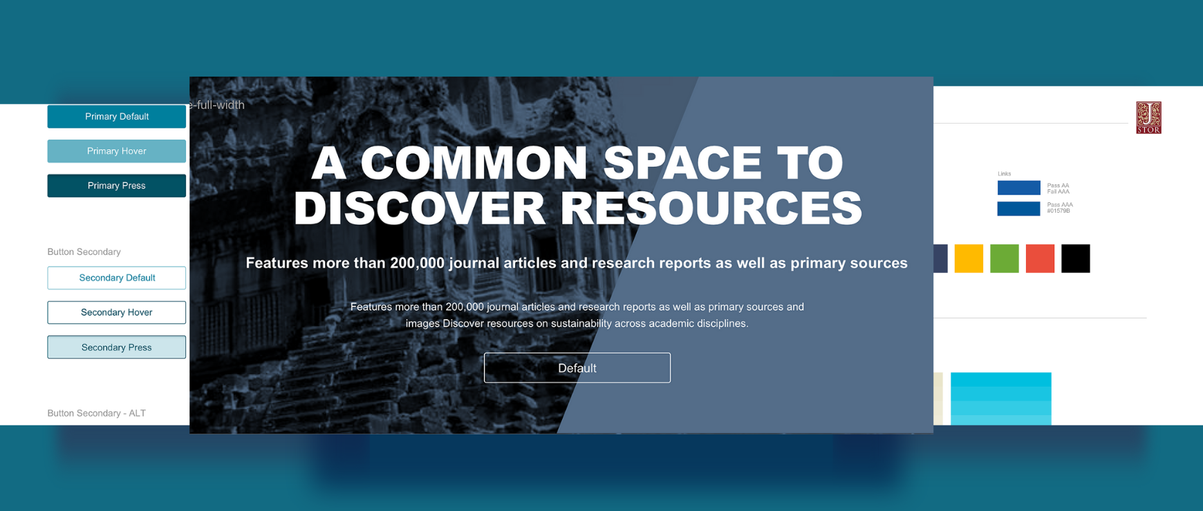
Our team initially conducted a design sprint, but modified our approach to utilize only the tools that were pertinent to this project to refine the layout, look, feel, and identity of the JSTOR library. To create a platform that would scale and that could be easily used across the entire JSTOR team, we used a consistent design aesthetic with reusable components for a recognizable, branded experience.

ADK delivered a series of wireframes for different pages, a revised IA, and user flows for user testing.

For ADK, it was all about creating a clean, easy-to-use, intuitive, and high-performance search functionality with a consistent design aesthetic.

Because JSTOR is accessed from different devices with multiple configurations, form factors, and connectivity, we created a light and fast-to-load site that is also compliant with the American Disabilities Act (ADA) and would allow users to easily find what they’re looking for, focus on the content, and take action.  

The Impact

The updated digital library presents a consistent digital language across JSTOR products, and provides a richer user experience that reflects the value of its resources. 

While this project was focused on improving search functionality, Fresh Tilled Soil understood the underlying needs to take a broader approach and develop a more engaging experience that would translate across JSTOR’s other products.

[The team] has worked with focus, drive and energy and your team’s dedication has helped us do some needed thinking around what we want to accomplish. Thanks for the guidance and hard work!

Clare Zonsu

Director of UX

The end result is a lightning-fast search of educational resources that are empowering learners across the world. Further, we created a style guide that JSTOR continues to use to inform product design for future marketing sites, support sites, or other products.