It is impossible to know for sure what a prospect or client will need before we have a chance to dig in and really understand their challenges, however, it is possible to describe the most common approaches and techniques available to a user-focused product design team. That is what we do here.
“Our product/software is outdated. I feel like we need to redesign the UI to make it feel new and relevant.”
What they are probably saying: “I don’t really know why we’re not getting the traction we need, but because the UI is a few years old and it’s the most visible thing, I’m going to start the conversation there.”
On the surface updating UI sounds like a very specific fix, but it is more often a symptom for some other underlying issue. UI is the most visible part of the product so it often gets the blame when users struggle to adopt or use a product.
If a product has underlying value, it’s been our experience that mediocre UI is rarely enough of a reason for users to abandon it entirely.
I’ll concede that if the UI is so awful that you can’t even login, or do the most basic things, then it will scuttle any attempts to deliver value.
The point here is that we often make assumptions about pain points before we have real evidence. Redesigning the UI might make the product look better but that doesn’t guarantee you’ll solve the user’s problem.
Potential Approaches and Solutions
The first step in this scenario is to establish what the real pain points are. This can be done in a few ways.
- If you are certain you know what the problem is and you have data to back up your argument, you can develop a hypothesis to test with actual users (e.g. The onboarding requires too many steps, which is leading to first-time user frustration and abandonment) and then design an experiment to test that hypothesis. This can be done using the Design Sprint methodology. Design Sprints are not your only option.
- If you don’t know what the problem is, then you must start by doing qualitative user interviews to establish what the user’s pains might be. This can be as easy as calling 8 or 9 prospects and planning a short interview. By asking them questions about their experience as they step through your product, you can identify patterns in usage and potential pain points.
- Once the real pain points have been established you can then move on to assumption testing, writing JTBD, developing personas and drafting the experience maps or journeys.
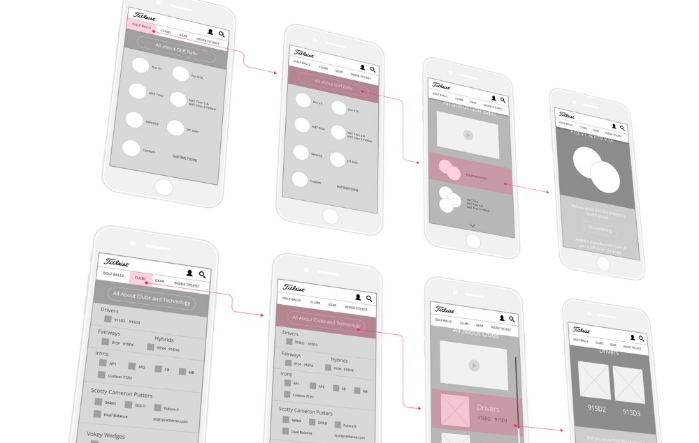
Case Study: Titleist
“In a situation like this, it’s fundamental to understand content requirements and user needs before making major UX or UI changes. The digital experience had to simultaneously support a complex combination of e-commerce functionality, brand communication, and social community engagement.”
“Customers love our product once they start using it, but the product UI is so inconsistent/unusable that we’re struggling to close accounts. ”
What they are probably saying: “Sales is telling us that prospects are either slow to adopt the product or are churning faster than anticipated. The customers can’t seem to get past the clunky UI and experience the real value of our product.”
On the surface this might seem like the same problem as #1, but what the client is experiencing is significantly different. In the first challenge, the outdated UI is perceived to be a problem, in this situation it actually is.
This is a common complaint with B2B software. Especially when the product has had several back-end updates, but the front-end looks like something from a Nineties sci-fi movie. Thanks to ubiquitous on-demand experiences, users’ expectations about how quickly it takes them to identify value in your product have increased dramatically. In these cases the product needs to immediately reflect the cutting edge nature of what’s under the hood.
Potential Approaches and Solutions
- Without sounding like a broken record, the first step is to understand what the value of the product is and whether it truly solves a customer need. If you’re still struggling with that step then I highly recommend doing the appropriate work on Product Vision and Product Strategy.
- Beyond understanding the user experience research and confirming the underlying value of the product, the next step would be to break down the initial onboarding into user maps or journeys. This allows the team to identify the bottlenecks, confusion and potential A-ha moments.
- Getting your user to their “A-ha moment” as quickly as possible is more important now than ever before. Reducing friction in the UX and UI is the goal here.
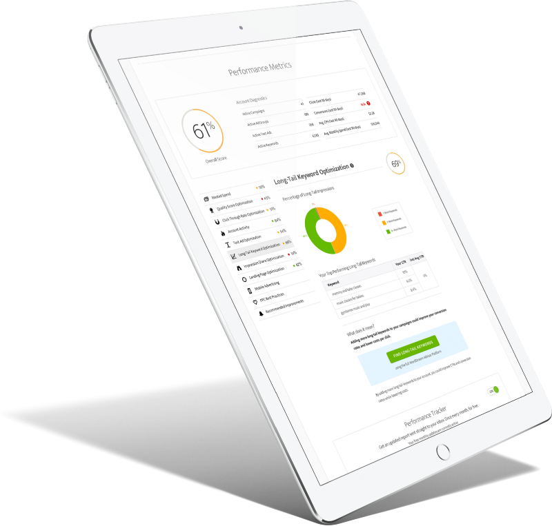
Case Study: Wordstream
“Diving deep into the product, we observed firsthand how clients were experiencing it. Users certainly could find the data they were looking for, but it was a chore. And people loathe chores.”
“Our SaaS offering requires a lot of internal effort to make it work. We want to rethink the UX to make it something customers can manage themselves.”
What they are probably saying: “Our product acts more like a mechanical turk that requires a ton of internal support, either because it isn’t intuitive or because key features have never been built out.”
It’s not uncommon for early stage products to have a few hamsters on wheels behind the scenes, but what’s terrifying is when an established company still relies on humans to make things work on the back-end. I had a personal experience with this a few years ago with a well-known payroll product. Half way through a new employee process I was prompted to call an agent. Not what you expect from a self-service digital platform.
As more companies invest in digital transformation, they run into these issues all the time. They try squeeze new ideas into the old paradigm. This can also mean combining tools under a single experience before they have tackled the single sign-on or account switching UX requirements.
Potential Approaches and Solutions
- Bubbling up the value of the underlying product means actually understanding its the value to your customers. I’m always surprised how few people can articulate their product value. At a recent conference I spoke at, I asked the audience of 1,500 tech and product people, who could recite their product vision in one sentence. Two people put their hands up. Two!! This is an unacceptable level. It’s critical that the product team has a clear Product Vision and a way to communicate that to each other and to the customer.
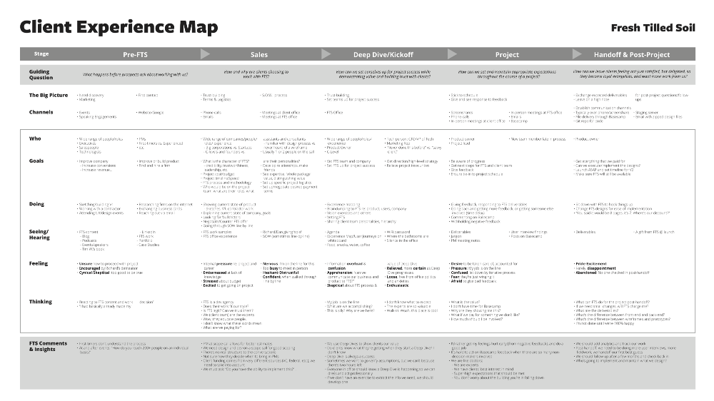
- The next step is to lay out the complete user journey and connect that to all service lines within the company. The completed Experience Map would show swim lanes for the external and internal journeys. Drawing out of this map would be the opportunities for improvement (see image below).
- Once you have your list of potential improvements, you’ll need to prioritize the opportunities and assign a Now, Next, and Later category to each.
Prioritization with Confidence
Prioritization is a big deal for most teams. Getting it wrong has serious consequences. This book might be the most practical and helpful book you read all year.
To download this report, please tell us a little about yourself:
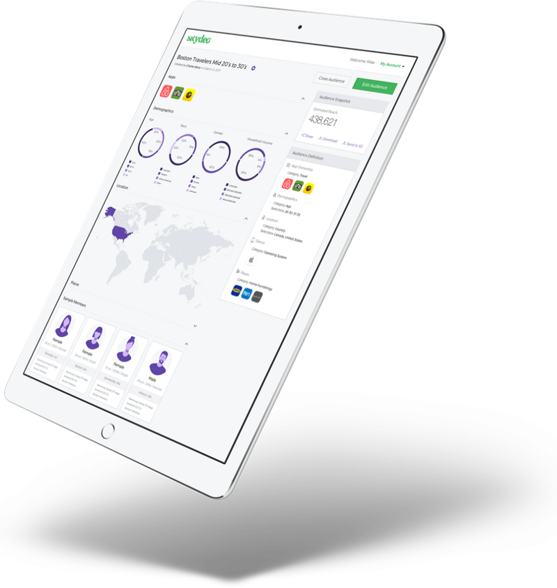
Case Study: Skydeo
“Your product is one of a kind, yet prospective customers can’t demo or purchase it without hands-on assistance. Sound familiar? This was the situation Skydeo faced. Just three weeks later, they had a working HTML prototype and a solution that empowered their customers with a product demonstration to help make informed purchase decisions.“
“Our competitors are doing [insert innovative or disruptive thing here] and we need to respond quickly with an innovative UX solution.”
What they are probably saying: “We wish we had thought of that first, but we didn’t and now we’re on the back foot. Honestly, we have no idea where to start so we’re looking for a framework to help us think through the challenges we face and come up with some solutions. Quick!”
External innovation and disruption from new companies is every established organization’s nightmare. One minute you’re running a taxi business and the next thing ride share, bike share and car clubs are eating your lunch.
The challenge here is not to respond with a knee-jerk reaction and just implement a me-too solution. Taking a step back to understand why that new innovation is so attractive will help frame the customer’s needs or pain points. Truly understanding pain points means validating them too.
As my friend Radhika Dutt points out, “…when you’ve developed an interesting new technology that has many potential use cases, it’s especially difficult to find the right one. Starting with a solution, rather than with a problem, will inevitably bias your customer discovery process. You’ll find yourself involuntarily pointing out the use cases to prospective customers, rather than listening to their problems.”
Potential Approaches and Solutions
- Customer discovery processes are inherently risky because every researcher brings a set of biases to the table. A real problem (that which the customer agrees with) may not be particularly valued (that which they don’t care to solve immediately). In extreme cases, where the team lacks context of talking to the user, personal bias may be the only data they have to use. Doing a proper analysis of the real pain points means establishing validity only when that pain point is both verified and valued.
- Deliberate discovery frameworks are another approach to validating potential solutions. My favorite is Nate Walkingshaw’s Directed Discovery process that prioritizes building a safe environment in which product discovery to happen, over a dogmatic process. In Walkingshaw’s words, “I argue, that to enable continuous creative iteration, you need something that provides guardrails to protect teams from too much innovation (creating a solution for a non-problem), over-engineering, and inserting personal confirmation bias in affordance choices.”
Case Study: Cengage Learning
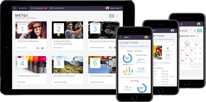
“Originally a respected textbook publishing company, in 2014 Cengage Learning was ready to disrupt the deep-rooted traditions of higher education. Far ahead of their competitors, Cengage recognized the future of education did not include bulky textbooks, it would be a digital future where the classroom was brought to the student.”
“Our product line has become unwieldy and inconsistent in terms of UX/UI. We need a design system that’s easy for our dev team to implement.”
What they are probably saying: “We need a design system that’s easy for the design and dev teams to implement. There are too many elements and not enough unity. We need one ring to rule them all.”
We hear this for both existing products with new components and expanding product lines. It’s easy for a product to evolve in terms of functionality, while leaving the design systems behind to fend for themselves. This incongruence creates UX and UI debt.
Potential Approaches and Solutions
- The ideal solution here is a universal design system that guides all team members, regardless of their functional role, what needs to be included and excluded from the creation of new elements. Crafting and designing reusable UX and UI elements means a little more upfront work but with massive gains in speed and efficiency.
- An obstacle to universal design systems has been the adoption of whatever the most fashionable front-end framework is going around. This might be controversial, but developers should not be allowed to dictate the framework being used prior to the UX solution being identified and validated. We’ve all seen how difficult it can be to transition from one framework to another. Select the right tool for the job. Don’t pick the tool before you know what the job is.
“As our product has grown and we’ve added more features and elements, it’s become a messy collection of mismatched pieces. It’s Frankenstein.”
What they are probably saying: “We need someone to take a fresh look at our product and to audit it. Then present us with UX recommendations, first from a best practices perspective, and then from a closer look at our industry/users.”
Why a best practices perspective? Not because this is the perfect starting point, but because it offers the best bang for the buck. A team can get started on fixing the things that don’t meet general user experience standards far quicker than they can doing a full user research driven overhaul.
Although a best practice first approach isn’t always the right answer, making a bucket load of small fixes provides an immediate marginal lift to unit metrics like conversion, churn, etc. Furthermore, these changes can normally be made while a parallel effort of getting fresh user research is going on.
Another related question is, “We don’t need a complete overhaul, we just need some assistance sprucing up key areas that currently drive the biggest returns. What’s the best place to start?” This last question can really only be answered once some context is provided. The best place to start is often the were the largest pain is felt.
Potential Approaches and Solutions
- When you’ve been working on a product for a long time it can be hard to see the wood for the trees.
- As suggested, parallel approaches can often be the best way to tackle the low hanging fruit, while simultaneously climbing to the highest branches for the really ripe opportunities. This can be done by mapping best practice UX and qualitative user research against each other to see where overlapping opportunities exist. For example, if the pain point appears to be around user onboarding, there will be some general concepts that can immediately improve the user flow. In the case of Slack, their design team at metalab, looked at best practices in the gaming industry as a way to simultaneously provide value and differentiate Slack from competitors.

“We gave it the color scheme of a video game, not an enterprise collaboration product.”
Case Study: Cengage Learning
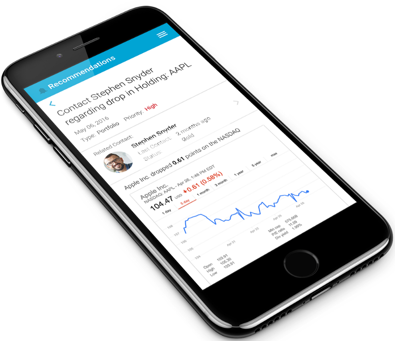
“The financial experts at Broadridge needed to unify multiple products under a single user interface while making the overall UX simpler and more effective. Whenever a company acquires new technology or data there is bound to be friction between the old and the new. Broadridge approached us to develop a uniform platform that would be the single product experience for their existing and newly acquired assets. That’s just a fancy way to say that they needed to untangle the mess of multiple software interfaces delivering on the same outputs.”
“We know our users/customers have trouble with [insert common experience here], but we don’t know how to define their pain clearly and then create a solution to address it.”
What they are probably saying: “I know my industry and my customers very well, and I see them struggling with this issue day after day. My gut says that if we could validate that hypothesis we could also find a way to solve it and make a lot of people happy.”
This type of problem is a catch all for new innovations in existing industries. Whether it’s an existing company with a new insight or a new potential company with a ground breaking idea, the approaches are similar.
The key to making this work is to make sure there are no institutional assumptions being made. Being a long-time expert in your field does not mean your assumptions don’t need to be tested. Successful people get stuck in bad paradigms because they anticipate that the behavior that made them successful will keep working forever.
Potential Approaches and Solutions
- Assumption Storming is an exercise used at the beginning of a Design Sprint, but can also be used in isolation to reduce risk. The idea is to identify which things we have going into a project are facts and which are assumptions. This then leads to identifying which of the assumptions are dangerous. In other words, if we don’t understand them better we can end up in a heap of trouble.
- Once you exhaust the assumptions (you may never list them all), you’ll need to pick one or two that need to be tested or understood. This means taking action. You’ll need to take the assumptions out into the real world and do research. Are these things as risky as we thought they would be? Do others share our perspectives, or are their other questions that need answering? Research can be qualitative or quantitative, or both. The key is to turn an assumption into a fact or, failing that understand that this unanswered question could trip you up later.
- Making prototypes and getting them in front of potential users is the best way to do the assumption testing. These don’t have to be high resolution but they do need to be able to get answers.
Case Study: TableHero
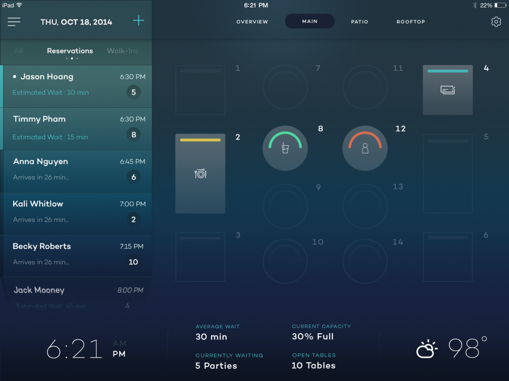
“Way back in 2014… Deap Ubhi, the Founder and CEO of TableHero is a veteran product executive, investor, and start-up mentor. He also comes from a family who has owned and operated a restaurant just outside of San Francisco for almost 30 years. His concept for TableHero was to create an iPad solution that was simple to set up, easy to use, and costs a simple monthly fee that allows restaurants to manage to their restaurant and customers.”
“We’re transitioning from an engineering focused company to a UX focused company.”
What they are probably saying: “I need help educating my team and creating a user-focused product organization. I know this is important but it’s hard to know where to start. How can I drive UX/UI focused change across the organization?”
I’ve already written a bit about digital transformation and how companies can navigate the challenges associated with such a big change, so I’ll keep this brief. For the most part, transitioning from an engineering focused company to a UX focused company is a large or enterprise level issue. There are exceptions but the bottom line is that this kind of change is both a top-down and bottom-up transition.
Transformation is never just an executive level initiative. While this is true in terms of aligning the company and the resource allocation, it’s implementation happens at the product level.
Once the product organization has established it’s own Product Vision and Product Strategy, the executive leadership needs to support that with the company-level capabilities and resources.
The reason behind this is that leadership may not be close enough to the customer. After a few years the CEO is not close enough to the details to really be useful and they are also not using their time wisely by doing this work.