One of the most interesting things about working in an agency is the number of windows we get to look through into other industries. We soak up as much context surrounding our client’s business, what matters to them and to their customers, so we can deliver the appropriate solutions for their project.
Through all of our engagements, we’ve worked with other designers, developers, and product owners and in the process have learned that everyone shares and talks about deliverable assets in a myriad of ways.
To level-set here, let’s talk about some of the deliverables we provide that can help keep teams from any industry, of any size, on the same page throughout the design and development phases of a project, and beyond.
First Up: Style Tiles & Mood Boards
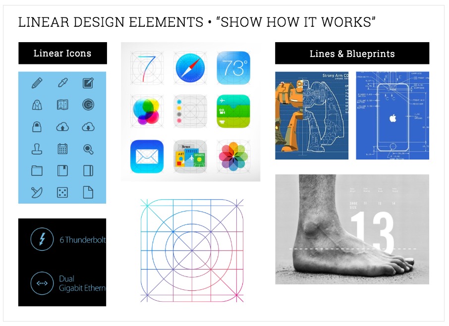
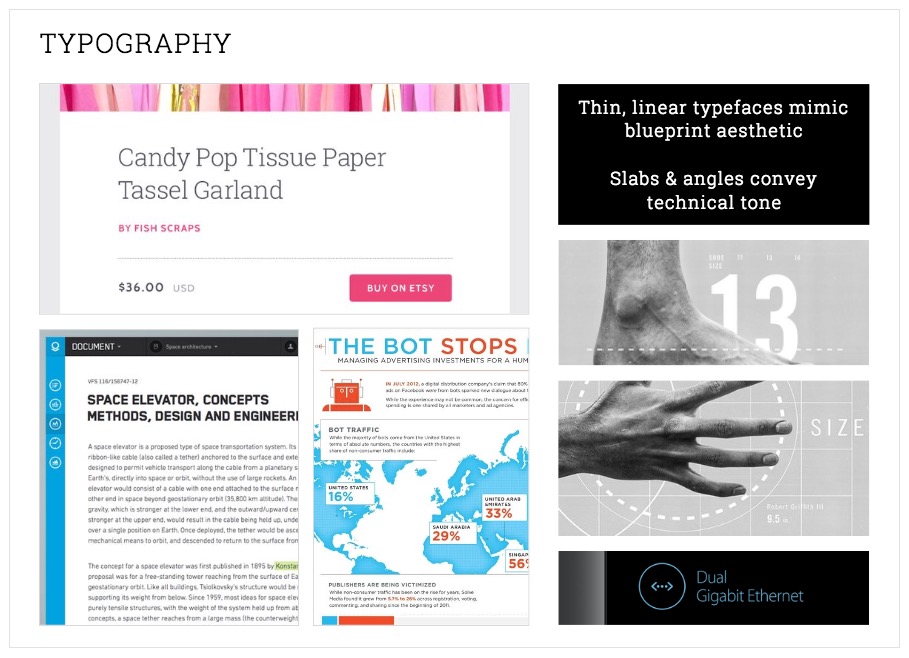
Mood Boards are just a fancy name for a digital scrapbook. I joke, but not really. The purpose of a mood board is to demonstrate the aesthetic tone one is hoping to achieve, and the inspiration one is drawing from to convey a possible design direction. A mood board could consist of colors, type styles, photographs, and illustrations, or maybe even snapshots of other existing designs. The goal here is to gather consensus for possible design directions before diving too deep and becoming attached to a concept that may only be discarded. Mood Boards are an excellent time for clients to be involved, as they can do so in a creatively low-barrier to entry sort of way. Point us to what you like, we’ll do the rest!


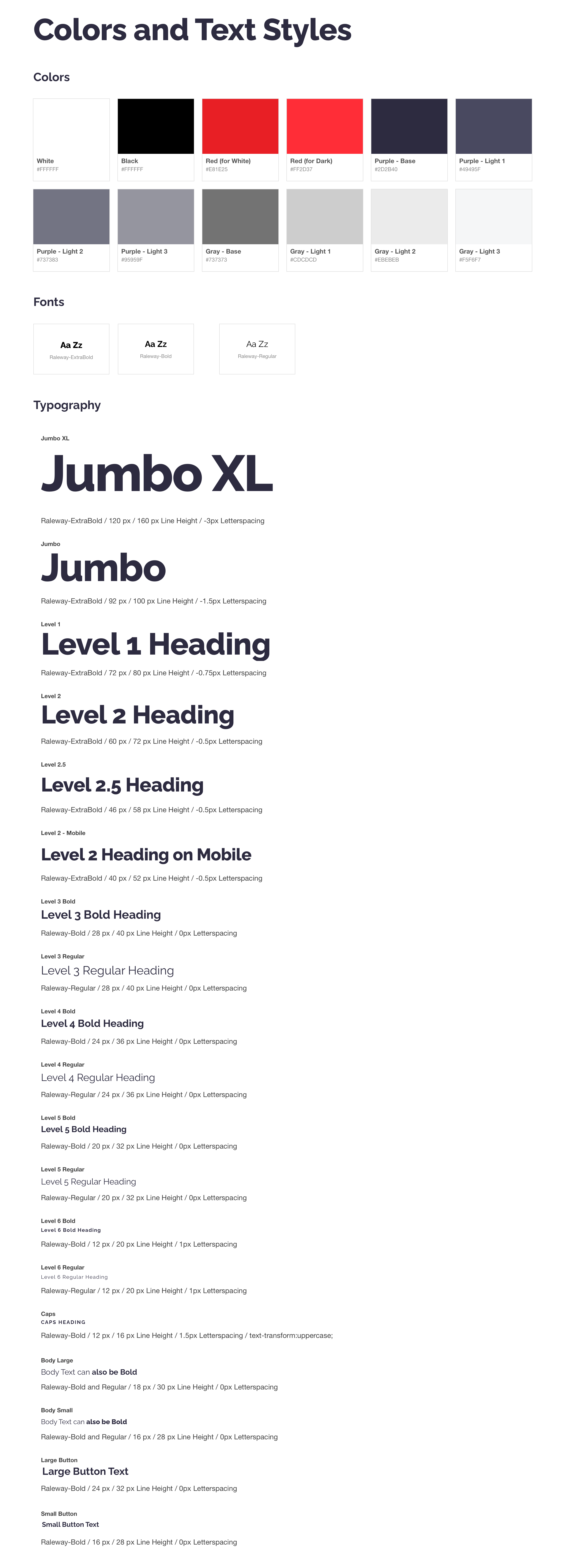
Here's a snippet of our own UI kit that we use to build our webpages.
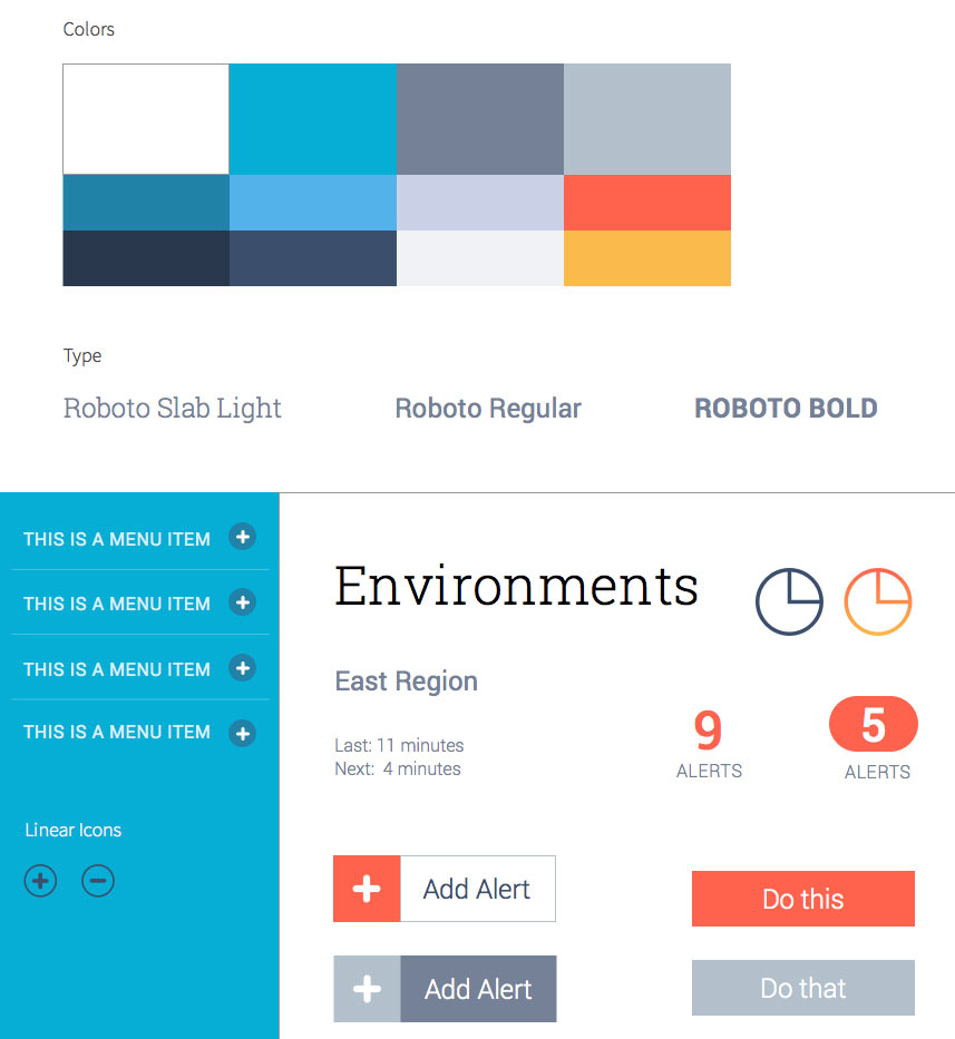
Style Tiles typically consist of purposeful typography, color, and basic UI components (buttons, form inputs, or other common elements), that help communicate the start of a design direction. Style Tiles take the theoretical directions presented in Mood Boards and turn them into concrete examples to talk through.

By using Style Tiles to convey the groundwork for a visual design system, it becomes easier for everyone to align around a general expectation of what that fleshed-out system may entail. Style Tiles aren’t meant to ‘lock’ a project into a narrow design direction, but they are an excellent way to convey a sense of what a project could look like, without committing the time to design entire screen mocks and then realize there was a misalignment on design expectations. Style Tiles are also an excellent opportunity to identify any potential color contrast or other accessibility issues (ensuring people with visual or other physical or cognitive disabilities will be able to interact with and understand your interface) that may arise with certain pairings of existing, or new, color combinations. The earlier accessibility considerations are made in the design process, the less likely they’ll become larger UX issues later on.
Next: Pattern Libraries and Static UI Kits
Pattern Libraries are collections of user interface design patterns. They typically include a variety of the most common, and oftentimes necessary, HTML elements as stand-alone elements. However, it is the grouping and organization of these elements into components (patterns), that truly make the Pattern Library useful, as these patterns typically represent the necessary arrangements of markup to create UI components with the most optimal user experiences (UX) in mind.
Oftentimes, these Pattern Libraries are created with minimal styling applied to each pattern, as their primary purpose is not to necessarily connote a particular aesthetic, but rather to represent the optimal document order, necessary states, and most typical base visual layout of each pattern.
For example, here is a common pattern we use when setting up the introduction headers to long-form articles or blog posts:
<header>
 <h2 id="article_title">
   Title goes here
 </h2>
 <p>
   Intro text or extended subtitle
 </p>
 <ul aria-labelledby="article_title">
   <li>
     <span>
       Published:
     </span>
     <time datetime="YYYY-MM-DD">
       Month Day, Year
     </time>
   </li>
   <li>
     <span>
       Category:
     </span>
     Category type(s) goes here
   </li>
 </ul>
</header>
With CSS, we have been able to take the above pattern and reuse it across many visual treatments, where typography, coloring, and even the visual ordering of the components have the same exact underlying pattern, which was very purposeful in its creation, but have looked very different. (You should ask me why the ordering of content is so important. It’d be quite a large tangent if I talked about it here!)
One thing to note about Pattern Libraries is that there is no one definitive source for how all components, ever, should be constructed. It’s near impossible to think up every configuration one might need for any and all projects. But where Pattern Libraries do help us is by defining essential starting points for some of the most common component configurations. Why re-invent the wheel multiple times over if all that really changes is the visual aesthetic? The key to constructing a good Pattern Library is to become inherently aware of what it is you are trying to build. Does this seem like something you’ve done before, or will need to do again? Generalize it by finding appropriate and straightforward ways to easily expand upon a base pattern, so as not to create mostly duplicative components.
Additionally, Pattern Libraries that focus on semantic, accessible markup can help ensure that your teams are building off of patterns that will provide the expected user experience for all users. So even if a pattern needs to be radically altered, you’ll still have a solid base to test against for an expected, inclusive, user experience.
Static UI Kits are created by designers to catalog the different elements and patterns that will be used in building out an interface. These kits serve multiple purposes, as they can be a go-to resource for quickly conveying branding guidelines and typographic choices, or to see if a pattern or element style already exists. The larger design files get, as a site or application is mocked out, the more important a definitive source becomes to keep designs aligned and to ensure outliers are seen as mistakes, rather than modified design choices that need to be reflected in a final product.

The UI Kits may be even more important for developers than they are for designers, as a well-constructed design system and UI Kit will allow for a large level of development to take place, without the need for full-screen template mocks to be delivered. Getting a UI Kit with a fleshed-out typography system, a palette of necessary colors, and general spacing rules can go a long way in helping to build modular components. Delivering appropriately styled-components and their states (hover, focus, active, invalid, etc.) will allow developers to build out a project pro-actively and with fewer questions around design and functionality expectations. A UI Kit is in no way a replacement for having developers involved early and often with the design process. But it ensures that important design details won’t be lost or forgotten during the final QA of a project.
Finally: Coded Style Guides
A Coded Style Guide is the fusing of a Static UI Kit and Pattern Library. The Style Guide collects the various markup elements, components, and coded templates into a single package. Additionally, it provides documentation supporting these items to explain the underlying design system, expected user experience, and necessary instructions for developers to successfully implement.
To put it bluntly, a Style Guide is your answer key. It’s how you keep your organization on brand and focused. It’s how to check your product for visual regressions. And it’s your source of truth for the expected semantic markup and user experience behind each component of your website or application.
So, you need a new page for your website? Utilize one of the pre-constructed templates adhering to the layout and typographic rules, so the page remains consistent with other pages of your site.
You’ve discovered you need to build a new component? Instead of building from scratch, utilize the library of pre-existing components and layout systems as a foundation, only making modifications and additions to the code base when necessary.
Switching from one CMS (WordPress, Drupal) or JavaScript framework (Angular, Vue, React) to another, if your style guide champions the tech-agnostic markup that is rendered in the browser (ours do), then you know exactly how your refactored codebase needs to compile to.
Having an encompassing answer key will help make that transition much easier. There’s no room for confusion on how components need to be restructured to fit in a new stack with a tech agnostic style guide. The only thing that matters is that the output matches what’s already in the style guide.
In closing
Each deliverable has an important role to play in helping us craft an extendable and reusable design system for our clients while making sure everyone working on a project is kept in the loop about important design and UX decisions, the entire way through.
As we’ve seen how difficult it can be to transition from one framework to another while still being productive, we love being able to help our clients in crafting these design systems and delivering coded style guides to help them in their transitions. Check out how Titleist is using a coded style guide to build more product marketing pages faster than ever, and tell us more about what kinds of challenges you’re solving at your company. We’d love to help.